We often talk about the UX design of products, but forget to investigate the UX of the packaging itself.
Packaging is a crucial part of users’ experience with a product. Ironically, the packaging is revealed after users have invested in a product: they’ve spent time researching the product, going to the store to buy it (or, if they shopped online, they’ve committed to waiting for their item to arrive instead of buying a different one), they’ve committed financially to it, and now they finally have the product in front of them.
The packaging is a user’s first interaction with the product.
Have the designers been careless with this element of UX? Or have budgetary constraints forced good packaging UX to be thrown out the window?
Of course, users have already committed their time and money to a product, so a poor package design is unlikely to make them give up on the item and return it, unused. But if you’re committed to the ideals of UX, the “done deal” aspect shouldn’t preclude designers from making the packaging as user-friendly as possible!
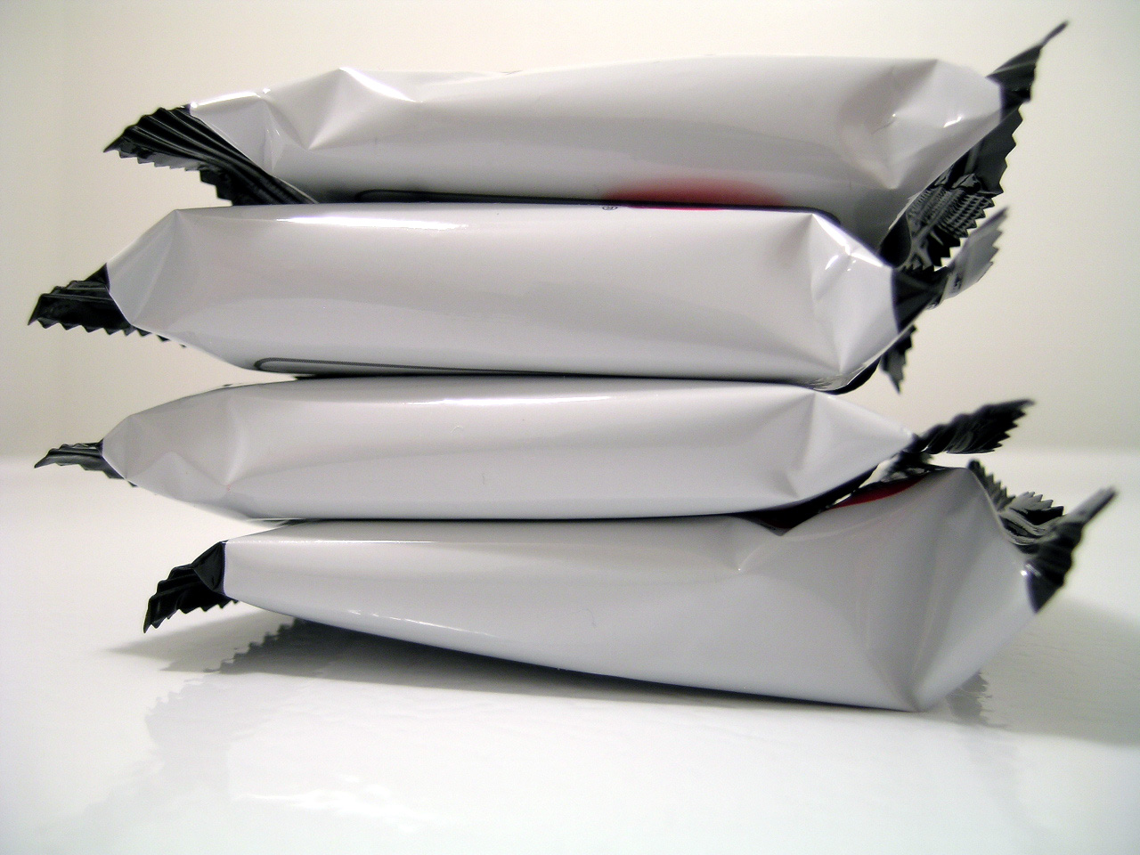
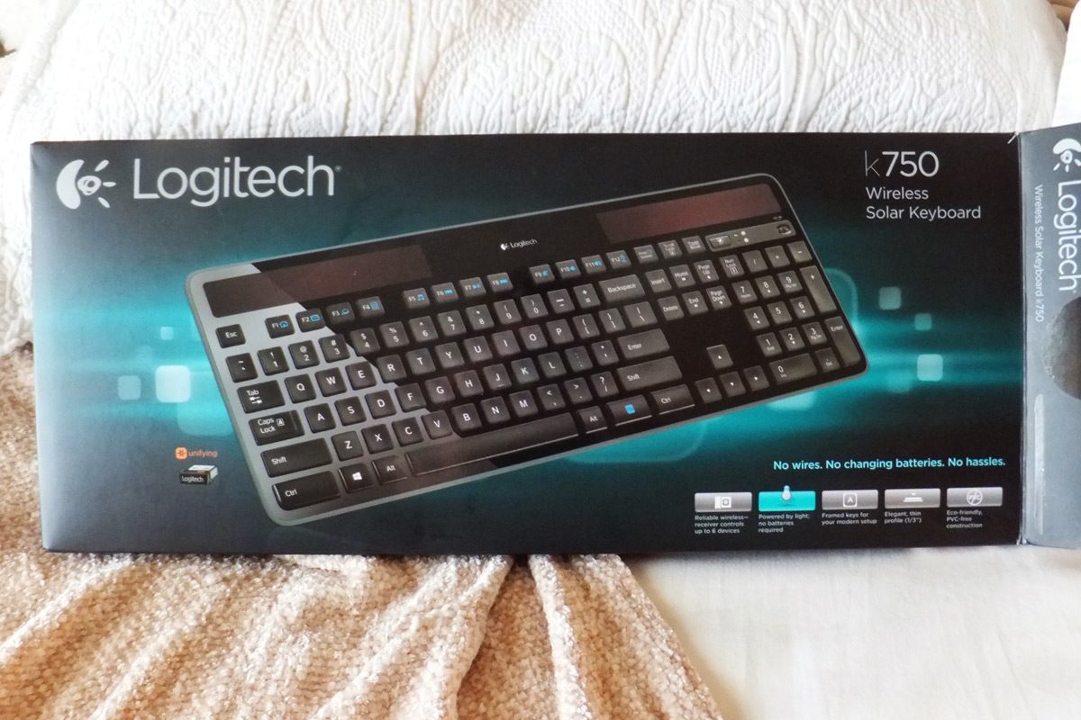
I recently had an experience with thoughtful package design when I purchased a Logitech wireless keyboard. Upon bringing it home, I eyed the colorful cardboard box warily, assuming that the dreaded PVC clamshell packaging lurked inside. We’ve all grappled with this maddening packaging before—it’s impossible to avoid and guards encases everything from flash drives to pizza cutters. “Here we go,” I thought, preparing myself for the lacerations that awaited.
I set off in search of my katana, wondering vaguely if my 2-inch Swiss Army blade could do the trick. (Disclaimer: it wouldn’t have, so don’t attempt it).
Much to my surprise, the scissors arsenal that I gathered wasn’t necessary. Instead of sharp heat-sealed plastic, the keyboard was nestled in a cardboard shell. There was no tape to cut; everything lifted away easily. It was self-explanatory without any instruction manuals or “STOP! Do not pass go until you read this!” papers on top.

For a quick setup, the most important part is the wireless receiver. A hard-to-miss arrow and matching yellow sticker directed me right to it.
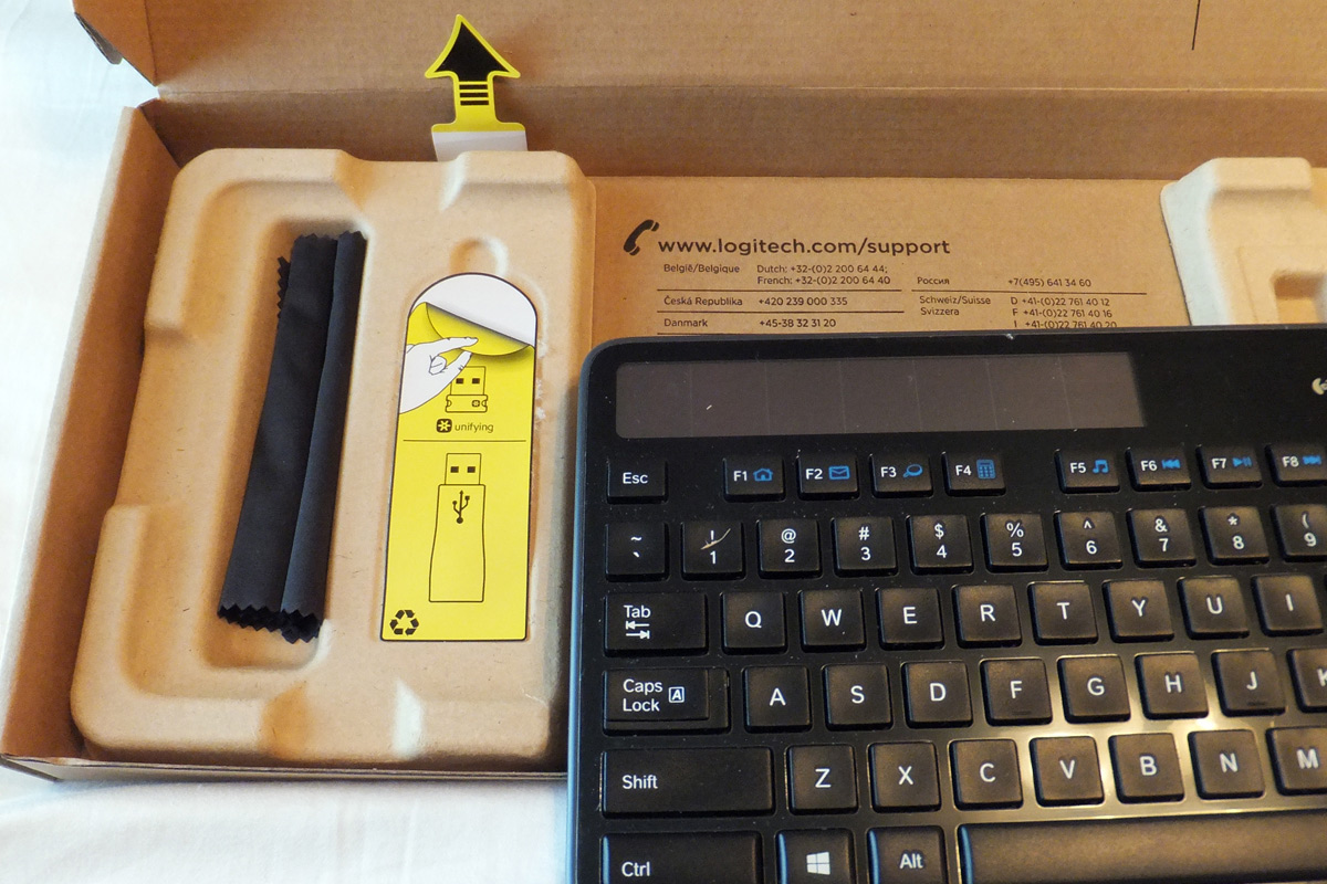
The handy illustration teaches me how to peel back a sticker (you never know).
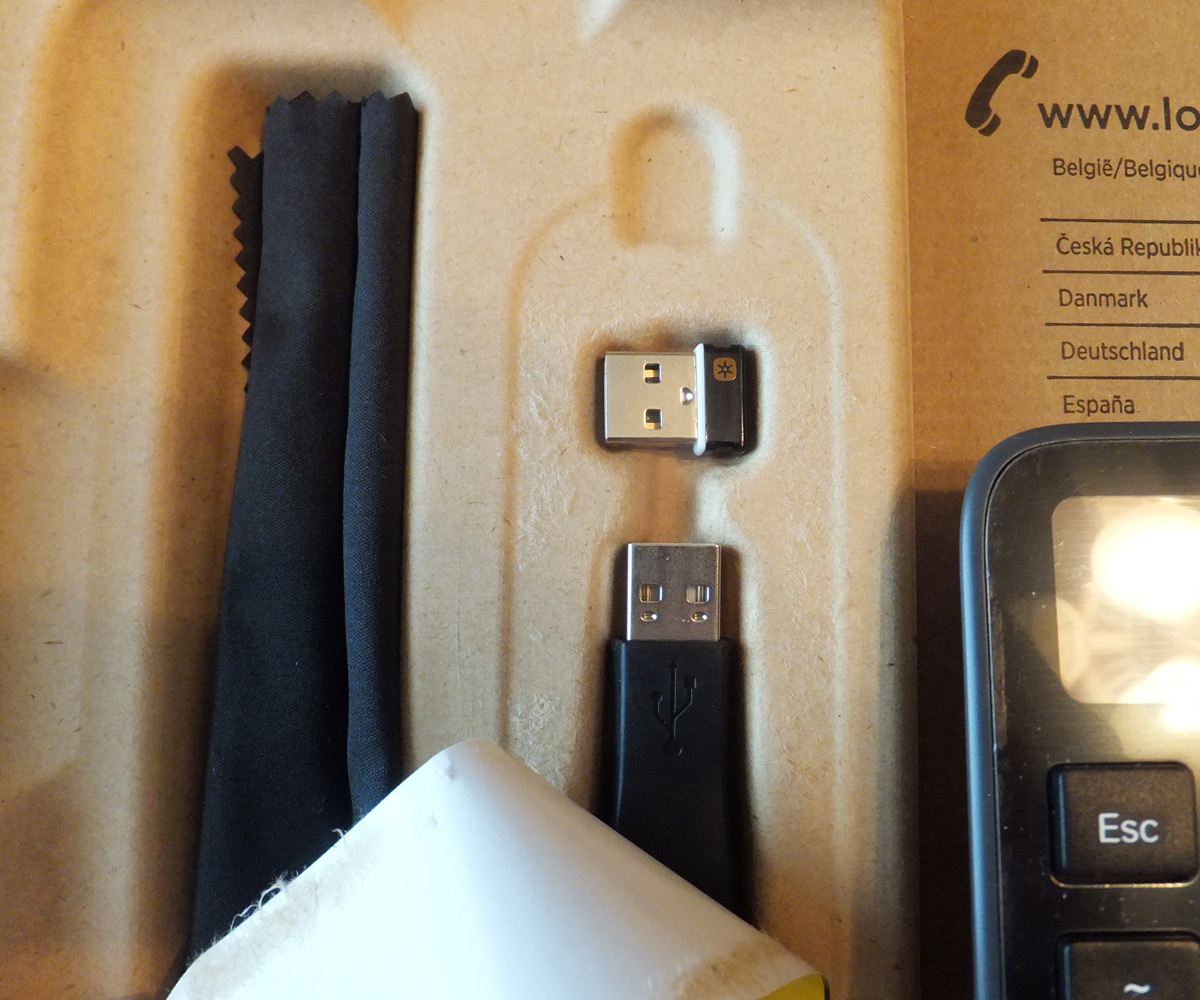
Even better, there was no plastic bag for me to tear open: the dongles were ready to use. They were still securely encased, and the designers had removed 1 additional step so that I could start using my keyboard sooner.
Another arrow highlighted the keyboard’s main selling point: the solar panel. An accompanying yellow tab literally illustrated how to activate it. I found this detail charming and not annoying because the designers had been very selective in their use of “Hey! Look Here!” arrows.

A simple copy of the “On/Off” switch means it won’t be overlooked.
The design worked because they had created a hierarchy of what was most important. I didn’t feel like there were 10 different things screaming for my immediate attention (lowering the cognitive load of the setup process).
When I was finished, there weren’t styrofoam bits and plastic bags to gather up. The cardboard casing was fully recyclable and lightweight enough so that I could pack it down into my overflowing bin. Best of all, there weren’t any sharp edges to deal with.
Final Thoughts
The ease of getting to my new keyboard made me feel like a simple goal had been reached, and I tackled the installation with renewed vigor. That positive feeling toward the keyboard and toward Logitech lingered long after the packaging was discarded.
