
The goal of any eCommerce site is (obviously) to foster sales. From the moment customers enter your site until they click that magical Purchase button, every aspect of your site should be effortless and enjoyable for your visitors.
So you’ve sorted out the obvious hurdles to good UX (no slow-loading site, no illegible graphics)—you’re in the clear, right? Not so fast. You might be creating psychological barriers for your customers in surprising ways.
Here are 3 more eCommerce best practices:
1. Don’t foist your app on mobile users.
If a user lands on your page, they’ve probably come to shop, not download your site’s app. Don’t force them to respond to a request (“Get our app for the best deals!”) before they’ve even begun browsing your site. Doing so makes them feel like their freedom is being restricted, which automatically makes them more resistant to anything you present.
Don’t force users to make a decision as soon as they enter your site.
It threatens their freedom.
Assume that customers are in a hurry and they’re in the mood to purchase now, not after downloading, locating, and launching a new app. Besides, your site shouldn’t require an app for a decent mobile experience; it should already be optimized for mobile users.
If you must have an app, then nix the splash screen. The example below shows an in-your-face (albeit beautiful) splash screen that Hotwire foists on users.
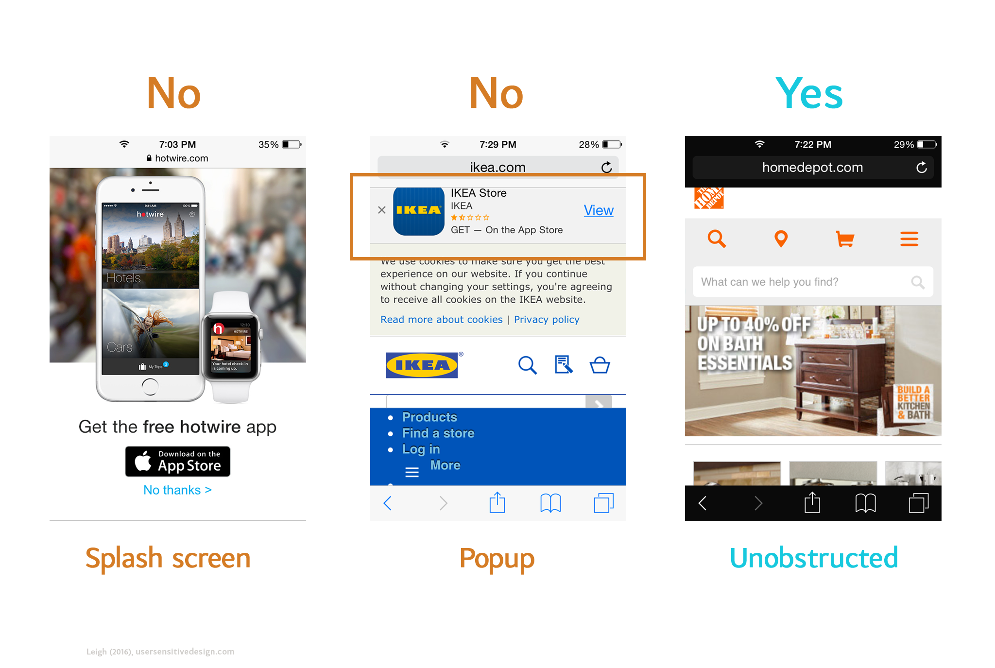
Ikea also hinders users with a popup request. Home Depot, on the other hand, invites users in without any caveats.
Aagh! Instant barrier for a mobile user.
In the second example, Ikea uses a popup instead of a splash screen. Again, even though users can theoretically ignore it, they’re still being forced to choose—can they live with the floating box that’s restricting their viewable area? Or should they click the x and get rid of it?
Instead, place the “Get our app!” unobtrusively near the bottom of the page. Notice how Home Depot immerses users in their mobile site without any immediate requests. Their app is subtly advertised at the very bottom of the page.
A user’s first few seconds on your site are important—make them pleasant and pressure-free.
2. Allow users to check out as a guest.
When shoppers begin the checkout process, don’t force them to create yet another account and password. It’s a drag. At best, you’re imposing an extra step on customers who reuse passwords from other 1,000 websites; at worst, you’re forcing security-savvy users to come up with yet another unique password. Either way, it’s a bad idea.
Note how even elegantly designed sites like Sephora fall prey to this mistake:
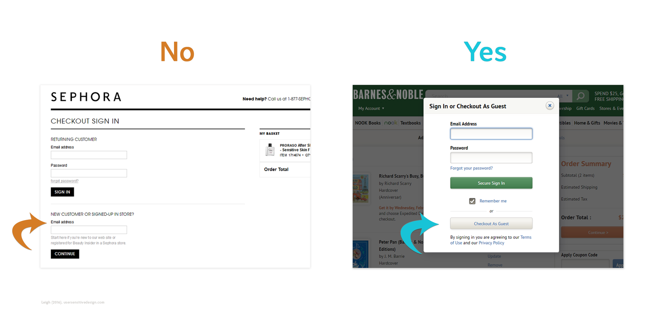
whereas Barnes & Noble lets users breeze through this step as a guest.
Forcing users to login also alienates return customers who don’t feel like tracking down their password. Again, this hearkens back to restricting users’ freedom and the psychological push-back that ensues. Give them the freedom to bypass this step and place their order already.
3. Don’t try to tack on other purchases during checkout.
In the final stages of purchasing, don’t bombard users with add-on offers. It’s annoying and cognitively taxing to make them continually weigh options (they’ve got their credit card out; let them buy already!). Furthermore, it sullies the service that the customer is actually purchasing.
By making customers repeatedly say “no,” you’re implying their purchase isn’t good enough.
Many U.S. airlines are guilty of this. In the final stages of purchasing, the customer is inundated with offers to purchase extra legroom, early check-in, and WiFi. As the user—who’s about to plunk down several hundred dollars on plane tickets—skips these offers, they’re left wondering what kind of service they’ll actually receive.
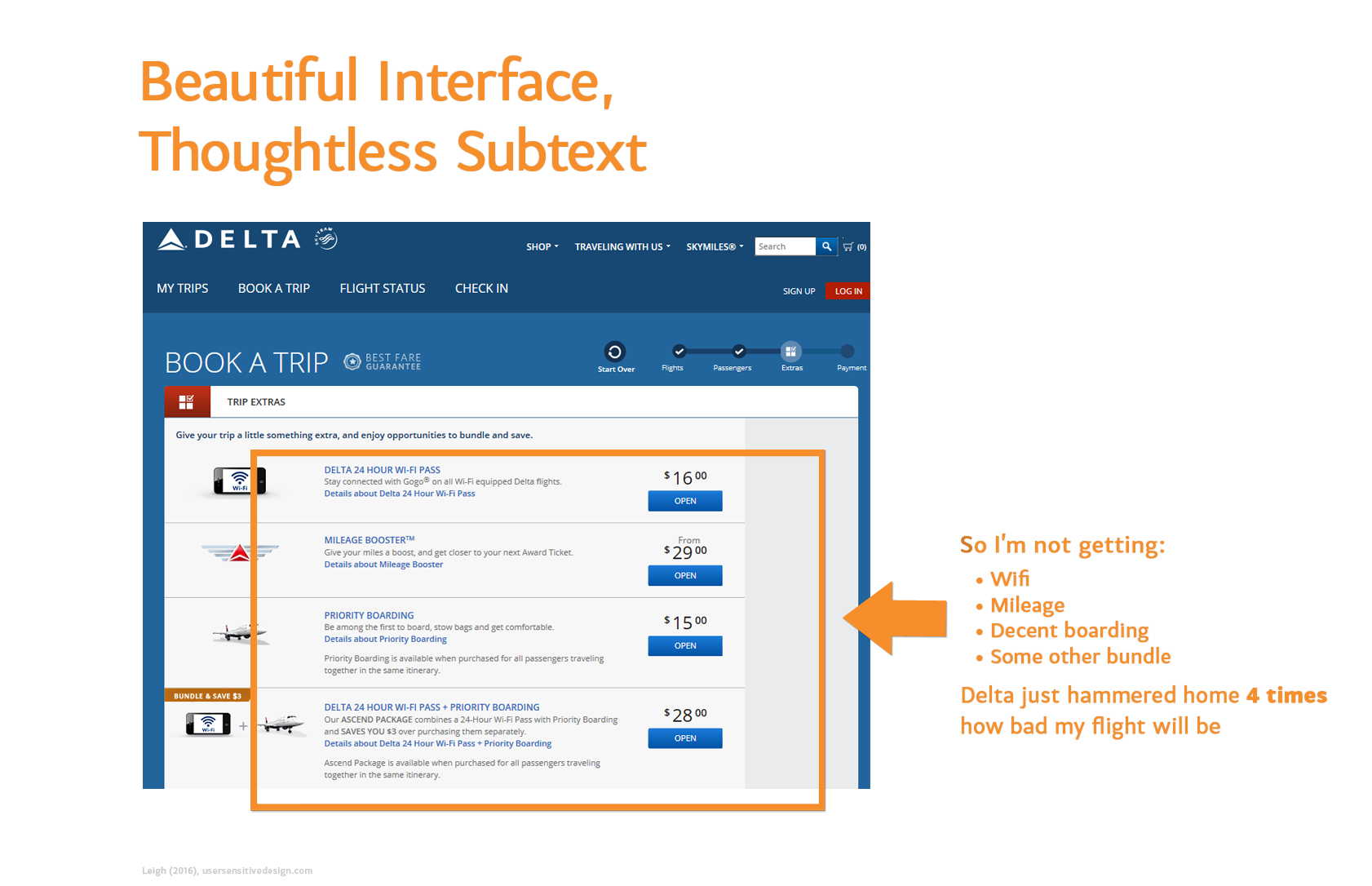
The user is left wondering what they’re actually paying for.
Airlines are telling customers that that their purchase is insufficient. They’re denigrating the amount that customers are spending while they’re in the process of spending it!
It’s poor UX to make customers feel that they’re “only” opting for the lesser service just because they’re forgoing all your add-on attempts. This practice generates negative affect and sets the customer up to have a poor experience on the actual flight. Instead, customers should leave your site feeling like their purchase is appreciated.
User delight entails more than just triggering positive emotions; you must also understand what turns users off. Steer clear of these 3 roadblocks and you’re well on your way to thoughtful UX.
